Since my contract for my last New York startup finished, I've had time to build something of my own. I created a training page in 3 days, and the UX decisions behind it reveal what separates functional from delightful. Here's the gravitas of small details that make users actually complete a booking flow.
Hi, my name is Tom Smykowski. I'm a founding engineer with 19 years in software, and I've scaled products to millions of users. On this blog I share insights on building production systems and the UX decisions that make them work.
Since my contract for my last New York startup finished, it leaves me with some time to work on some things of my own, at least until I find a new job. What I'm interested in are startup owners that look for a Founding Engineer. Since I've worked at many startups now, I have know-how on how to set up projects properly. My focus is mostly on supporting business goals, design and user experience while working full stack.
But that's not the main purpose of this article. In this article I'll walk you through things I did on the new page I've created. It's a page for trainings about AI for my city.
The Landing Page: First Impressions
Ok, so this is the version 0.1 of the page:
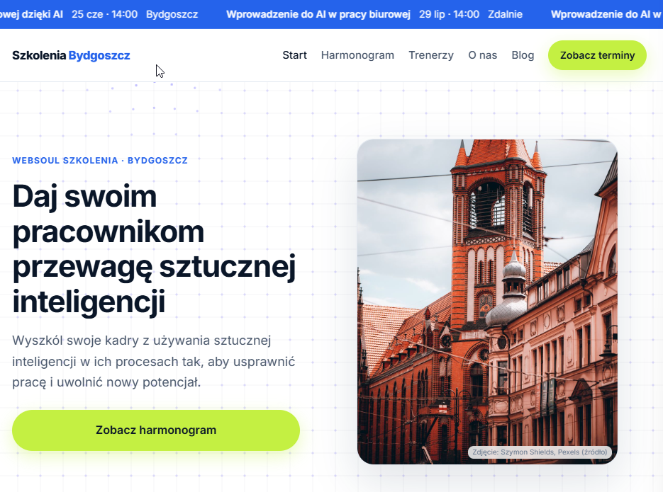
Now let's look at some things I've done here. First, we have the background, the dots and lines. Such patterns become popular lately, and I had some fun to follow the mouse of the user, so the mesh animates.
In the header we can see "Zobacz terminy", it's a CTA that helps drive people immediately to training schedule. It's important to have it for conversion.
We have intentionally two CTAs: in header and hero to grab as much clicks as possible, because it's a sales page. All in all the hero section should grab attention, explain in 2 seconds what is the purpose of the experience and drive people further.