Adham Dannaway shared a post showing that big companies don't always have great designs. He used Instagram's login page as an example. I found 21 issues and redesigned it.
Hi, my name is Tom Smykowski. I've spent 19 years building production systems and now focus on the intersection of design, engineering, and user experience. On this blog I share practical insights on building interfaces that work for everyone.
Adham Dannaway is a well-respected designer and author of Practical UI, a book that everyone aspiring to do any design work should memorize.
He's right. Corporations such as Meta that owns Instagram, and even Google, aren't good examples to inspire yourself regarding user experience and design. For example, both use placeholder instead of input label. The biggest culprit of Material Design, but not the only one.
Some years ago Amazon's login flow was described by some people as the standard of how login flow should be designed. But everyone knew it was one of the worst flows. When I seen these blog posts boasting about how it's great, my eyebrows rose.
And the login page of Instagram was also not a good example of design. I posted my principles for improvement that got over 10 thousand views, including:
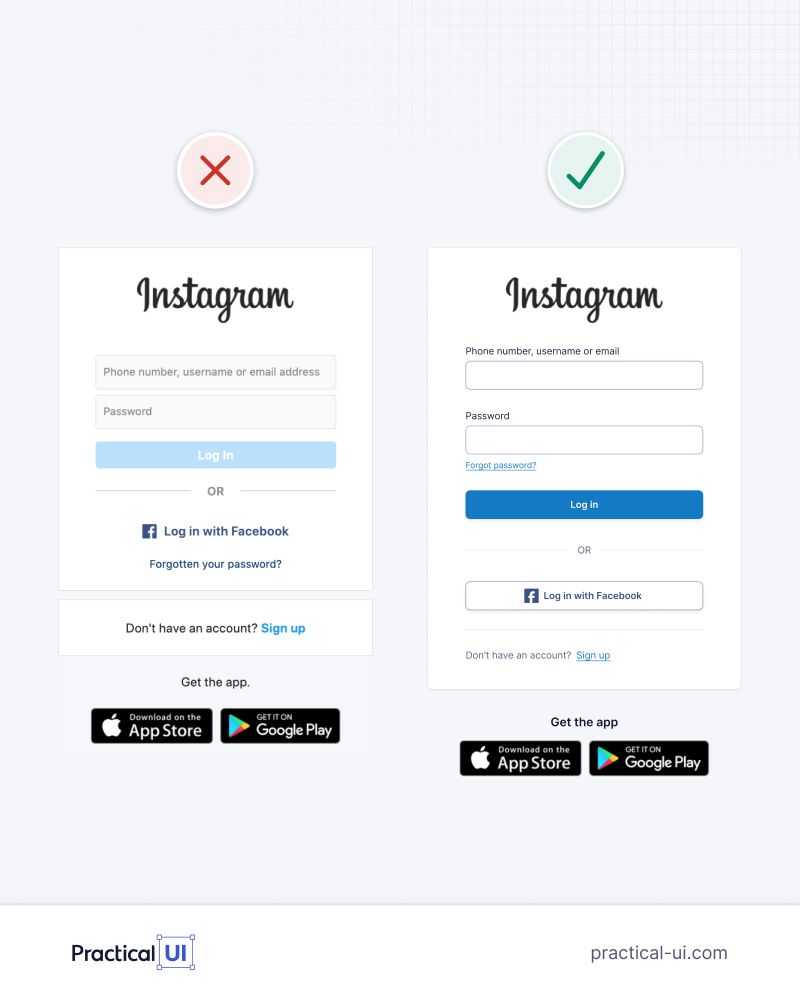
- Group the login fields and the login button together
- Make it immediately clear that this is the login page, not the registration page
- Add a password visibility toggle so users can show or hide their password
- Use a darker shade of gray to improve accessibility
- Define the page's primary objective before refining the design
Meta's design team seemed to recognize some of the problems and redesigned it. But there's still a lot of things we can improve. I found 21 issues in total covering contrast, placeholder, text fitting, misclick, flow, hierarchy, attention, theme alignment, and branding problems.
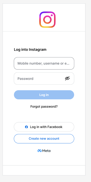
The full article walks through each issue with screenshots from my Figma analysis, and presents a complete redesign proposal that addresses accessibility, cognitive load, and the thumb zone problem on mobile devices.